
|
Disclosure: This post contains affiliate links.
We LOVE paint. And we don't shy away from using A LOT of it!
In six years of teaching art classes, we've learned that not all washable paints are created equal. Not all washable paints are actually washable. Not all washable paints are bright and bold and mix beautiful colors. This one does. We have searched long and hard for the best paint for our studio and we just can't keep it to ourselves: 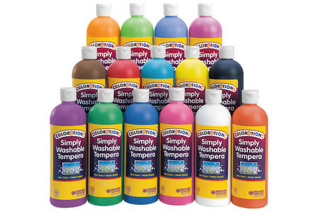
We buy it by the GALLON. (Like 4-5 gallons a week.)
But, it comes in smaller, 16oz bottles for your home use. And it's reasonably priced at less that $2.50 per bottle:
ALLERGEN INFORMATION
We LOVE that the Coloration washable paint is AP Certified and Allergen Free: Does not contain Latex Does not contain Dairy & Casein Does not contain Egg Does not contain Gluten Does not contain Peanut & Tree Nut Does not contain Soy
WHAT COLORS TO BUY
All the colors are great, but don't feel like you have to get them all. We buy only the primary colors. (Plus the metallics) And then we mix our all our secondaries and tertiary colors. You know how sometimes a yellow and blue paint makes a ugly green instead of a pretty one? Yeah, you don't need to worry about it with these paints... :)
HOW TO GET FREE SHIPPING
You can get free shipping right now on ordered over $33 dollars by entering a code: SHIP33 Otherwise, it's usually free shipping on orders over $99. If you need to bulk up your order to get to that threshold, I've listed some of our other favorite Colorations products below.
OUR FAVORITE THINGS
The tempera sticks are great for home use because they aren't very messy! The fluorescent paint glows under black light! And, everyone loves hot pink paint. And, if you've ever seen our facebook live videos, you know that our liquid washable watercolor is one of the most versatile art supplies you can buy.
I hope that you find this helpful! We only share the art products that we actually use in our studio and our homes. If you have another other questions about the art supplies that we use, ask away. We'd love to be a resource for you.

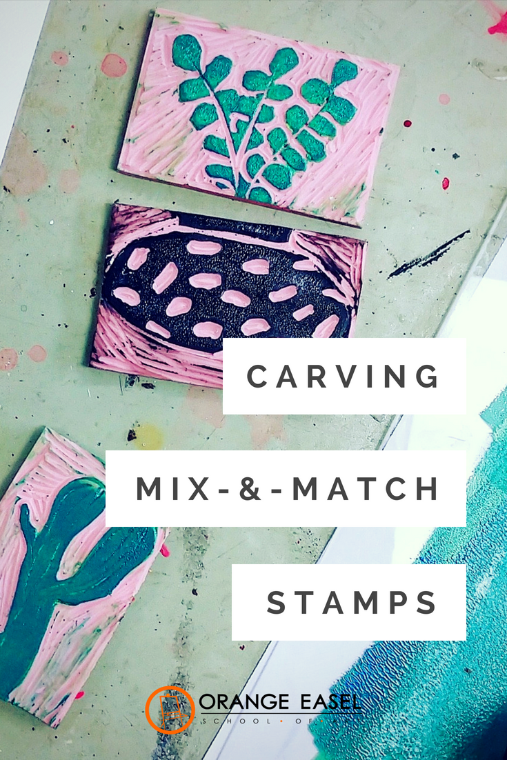
This pink stuff is made by speedball and can be cut to any size. For this project, we used pieces that were about 2.5x3.5". The smaller you go, the harder it is to carve!
I drew our design--three simple pots and three simple cacti--directly onto the rubber using a ball point pen. Then I carefully cut around each using a lino cutters and a small "v" knife. The "v" shape works great for details. I switched to one to the larger "u" shape knifes when I needed to remove the surrounding area. The cutters we use in the studio come with all the little knives we need and the extra knifes store in the handle when not in use! Remember, the areas that you remove will be WHITE (or the color of the paper. Art teachers, this is a great time for a lesson in positive and negative space ;) 
(I didn't take any picture of me carving my cacti, but here's an image of one of our students during printmaking month. See how she keeps her fingers back and out of the path of the blade? Safety first!)

For printing our cacti, we used block printing ink. The real stuff. Yes, you can use paint, but it just doesn't produce the same crisp, clean lines as the sticky ink. You can also use these stamps with just a regular stamp pad (these are our favorite washable ones) but the prints will be a slightly washed-out version of your stamp.
After you spend all that time carving, you going to want the best print possible--and block printing ink is definitely the way to go. We roll our ink out on glass plates (just the inside of some thrift store picture frames) using a brayer until it makes that signature kissy sound. (The kids love that reference). Then, we used the brayer to roll the ink onto our stamp. You can also just press the stamp into the glass plate if you want. However you do it, you want to make sure that your hands stay as clean as possible! 
The pots and succulents are interchangeable and can be mixed and matched. For the green ink, I rolled some with a little but of added yellow and some with an little bit of added blue to give me slightly different shades of green.
I think I like the pots best in the simple black and white. 
But I also had some fun on black paper. The white ink for the pots wasn't quite "WHITE" enough on the black--it read as light grey. While the white ink was still wet, I sprinkled it with cooper embossing powder and used a heat gun to turn it into a raised metallic detail. (That will have to be another blog post though!)

I hope you have fun trying this project out with your students or for some creative time for yourself.

Our favorite printing supplies:
Orange Easel is a participant in the Amazon Services LLC Associates Program, an affiliate advertising program designed to provide a means for sites to earn advertising fees by advertising and linking to Amazon.com
|
Orange EaselContent inspired by the artists and art created in our studio. 
Orange Easel began as a small art studio in my basement and continues to grow and serve our community. Read more about our story here.
Archives
April 2024
Categories
All
|


 RSS Feed
QUICK LINKS
|
|
|
|
LIBERTY STUDIO
249 W Mill St Ste 107 Liberty MO 64068 816-407-9266 |
PLATTE WOODS STUDIO
7617 NW Prairie View Rd Kansas City MO 64157 816-216-7126 |
|
Copyright © 2023 Orange Easel. All rights reserved.
Privacy Policy |
|